Monday, April 21, 2014

Exam Review

So Last semester I wasn't too ready for the final exam, I underestimated it and got hurt because of it. This time around I've been getting ready to the point where I've started looking ahead to knew engines and shaders in areas that weren't totally covered in class.
Lets not have a repeat of this.
 

I've been studing for the last few weeks, so I thought it would be good to blog some content, being able to explain something always helps keep information in your head. I did this for the midterm as well, but it was a lot simpler than what I'm going for now.

I wont be covering the most basic stuff, I know the graphics pipeline, and how meshes are made, thats covered in my midterm review. As well as normal/ displacement mapping and toon shading.

A quick not is the 5 steps to HDR bloom, render to FBO, Tone map the FBO, Gaussian blur(Convolution kerning) and then render the blurred version with the original FBO.

Motion blur is done by using a accumulation buffer, rendering a bit or the last few and later frames.
I've gone through tons of code on particeleffects in shaders. Velocity based shaders are also done by rendering frames ahead and then subtracting their values. The ins and outs of deferred shading and lighting, how its done, and why we use it. A whole bunch of shadowmapping code examples. Threshold through photoshop tutorials, and over all just playing around with new engines and their shaders is what i've been using my time on

Unreal engine

Last blog I went over shaders in Unity, today i want to take a look at the other U engine, Unreal. Once again using the official tutorials. While writing shaders in manually is possible in Unreal (actually ShaderDevelopmentMode, is disabled by default) I'm going to go over the material editor, and lighting.
Heres a quick look at a simple version of the materiel editor being used, with GUI more common in hardware development, the properties of a material are set up this way in Unreal. On the left we have a big box with a lot of inputs. Thats the material, and its name can be seen on top. The inputs cover a large portion of data and maps. Texture, spuclar and a normal map have been applied simply by loading in the texture and connecting it to an open slot on the material. Theres also use of speed tree, a program used to make quickly randomly generated trees. In this case its connected world position offset, which lets speed tree change the world space of the vertices.

Honestly at fist glance this system looked great, easy to read and understand and it covers a lot of the basics for shading materials. Once i figured out about Material functions it was pretty great. Material function are small material shaders that you can create to make an even simpler experience when using the material editor
 The example here shows a screen blend function, taking two layers and blemding them together. Now you can downsize all these windows into a single window, from the inputs to the output. This allows anybody to use your effect/shader with ease. The materiel editor is an awesome little feature that makes creating effects super easy, it can even use premade math function including things like Lerp and some you see from .glsl's like Clamp.
There are 4 kinds of preset dynamic lights in unreal and those are Directional, Point, Spot, and Sky lights. the reason i did this blog on the material editor and lights is because lights have light functions that can be edited just like materials

I didn't mention that Unity has a similar approach to materials, but from what i've seen the Unreal engine's cleaner and simpler and is good for implementing the simple shaders that I'd use any day, but Unity still has its uses, allowing you to code in shaders by yourself easier.


Sunday, April 20, 2014

A look at Unity

I've decided to look into the shader options of unity since its already on our school laptops and i wanted to mess around with a fancy engine. Everything I'm looking at today i got off of unities help area/website. First thing i got to say, theres more than 80 built in shaders and shaderLab as a way to create more of your own. Shaderlab lets you add surface, vertex, fragment, and fixed function shaders, while the preset shaders revolve around vertex-lit, diffuse, specular, bumped diffuse, and bumped Specular. From there the built in shaders split into 5 parts; basic, transparent, transparent cutout, self illuminated, and reflective.


The first shader I'm going over is Parallax Bumped Specular, sounds complicated, but its just normal mapping with better depth. Its adds a height map from the normal maps on the object and creates greater depths on rendered objects. Makes these stones look like the have really deep rivets. The height maps are achieved by getting alpha maps from the normal maps where black is no depth and white is max depth. The specular portion is based of the blinn-phlong lighting model. The reflective and highlighted part on the left is a simulated blurred reflection of the light. The Shininess slider effects the strength of the reflection. A more complicated version of what what we've done in tutorials, but still not that complex.


The farther you get in the list the cooler stuff gets. First on the left we have a transparent version of our last shader, the transparent values of the object are taken from the alpha channels of the main texture. So its works just the same as transparency for sprites. Next the middle picture its self illuminating a cool simple shader, you add a texture to be the illumination map, based on the alpha values, black being no light and white being max light. The white sections light up no matter how much light is hitting them, so it creates a glow in the dark effect. Finally reflection on the right, its a simple reflection and it requires a cubemap to actually show a reflection. Like before with illumination, the strength of the shader is based on the alpha channel of a texture, and once again, black means no reflection and white means full reflection.

Another shading method that can be used in unity is the Surface Shader. The surface shader interacts well with Unity's lighting pipeline well so its priority use is for shaders that deal with lights. It doesn't have its own language like GLFX, but it can be used for some interesting effects. 

Heres an example of one surface shader. This effect  is created by moving vertices along their normals. The surface shader is able to do this because data from the vertex shader can be passed on to the surface shader which goes pixel by pixel. it can be summed up simply with this line  
v.vertex.xyz += v.normal * _Amount; 
where "amount" is a multiplier between -1 and 1, that can be attached to a slider in unity. 

I'd like to go through a few more shaders and some custom stuff made by me in unity, but I also want to check out other engine's shader options, like the unreal engine.

Saturday, April 19, 2014

Street fighter 4

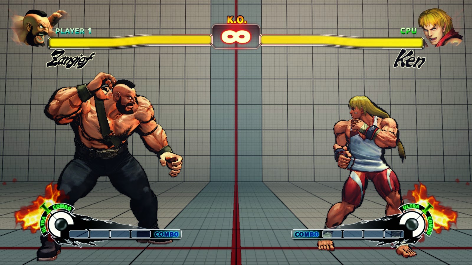
Today i want to go over the lighting effects in super street fighter 4. I noticed in the options menu that the game had 3 extra effects Ink, watercolour, and posterize. I'll be going over the three because they actually create some cool effects and street fighters art style has been talked about since its release. The first style is Ink, its the first and most used style. A lot of the concept or for street fighter 4 used heavy ink lines an example under this text. the way the effect is done is pretty simple, its the same way we did border detection for toon shading. The screenshots that i showed before of toon shading in my game used the same visual effect. By taking camera information, and normals, and calculating the area seen by the camera or light, the edge values are just the dot product of the light direction and the normals. The parts closes to the edge are around zero. Making a range around zero will highlight these edges. Heres the process reversed to see only the edges and black out everything else

The next effect is watercolour, Disappointingly it the same effect but instead of changing the edges to black it changes them to a maroon like colour, its lighter than the black and it does look fairly different, but it kind of fails to really express a watercolour like visual. I'd like to point out that when a character uses a powerful move the shader goes back to the old ink look on the characters. So the border is used twice as much and the black outline becomes even greater

 Finally the posterize effect heres an example of what its suppose to look like, the colours of an image chosen and created into multiple thresholds. thats makes a multicolored image into a little under a dozen.
Now this is the street fighter version, once again the same effect, but with a little difference. Street fighter already uses vary little colour differentiation and already looks like a toon like image, so the posterize effect here changes the normal border effect colour and range, notice all the highlighted areas are under the character now. This can simply be done by changing the range of the of the border select or by basing the border select off the light instead of the camera.

The effects used ended up being much lazier than i expected. They could of gone all the way with there effects, and actually made a posterize and watercolour effects.

Sunday, April 6, 2014

3D lighting in a 2D scene

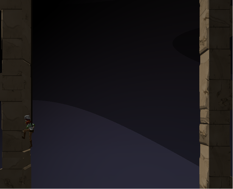
 An update on the game's main look so far. Decided to take out the Toon edge bolding, but kept the lighting technique. As for the hit box detection from last blog, it was pretty easy to do, but since our animator has a problem with getting animations done, I needed to drop it and attacking out of our game. All I could really show would be a screenshot with slightly red characters, its much for visible in video, but I've long since gotten rid of it.
     I also added a cool lighting effect. The farther you get the darker it becomes, I have a rather large skybox background lerping from bottom to top and back again. I also have the ambient lighting lerping, now all I have to add is a sun and a moon that can slerp by and I have a nice day and night cycle. This caused a cool effect I wanted to look into. The bars of light slide around in and off screen, as you see from the first screen shot there are 4 colours, then it moves to 3, then another 3. For the most part this colours slide around, in the last screenshot you see that the darkest part has moved to the far right corner.

     Now I didn't really use any code to do this, other than of course simple diffuse toonshading. I realized that this effect is coming from the large plain in the background, and it being so large that the spotlight doesn't hit it correctly. lighting on a flat plain was kind of cool to me, because the idea of 2D realistic lighting came to mind and I decided to look it up.

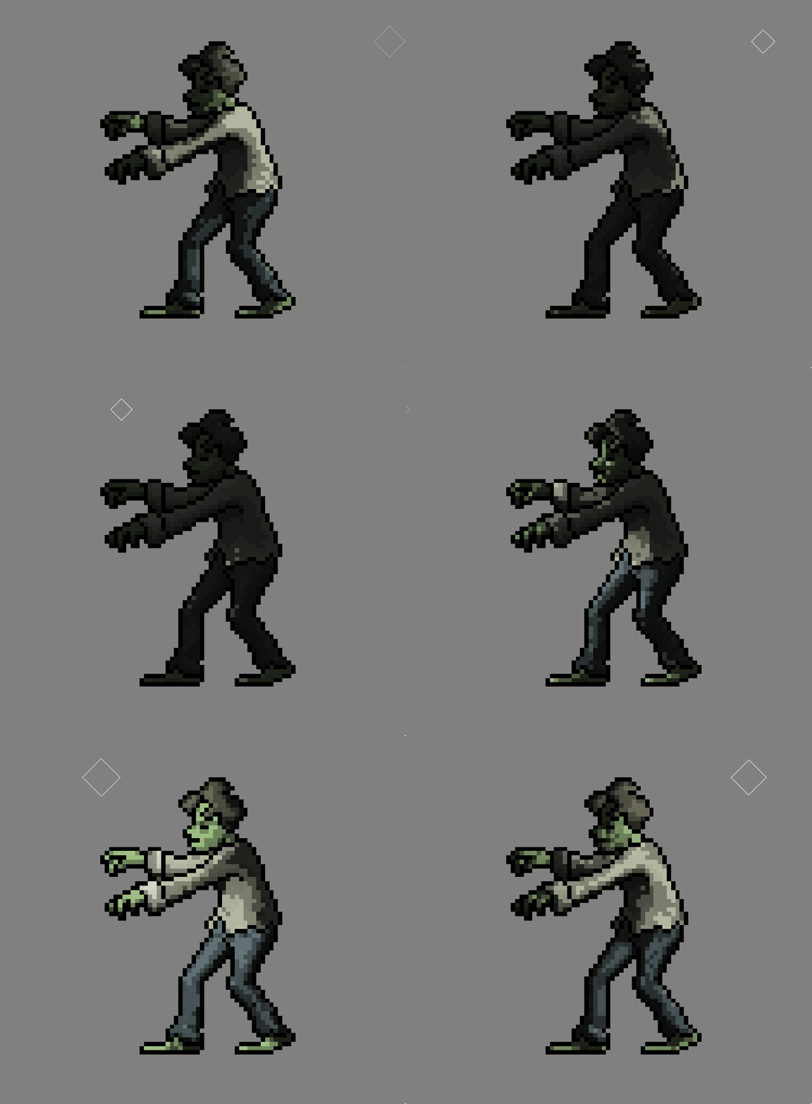


just  some examples

    Now the first one seems pretty easy, its probably already created in the sprite, and if its not its simply an orb that adds to the colour values around the blast with a gradient edge. Now the other one blew my mind when i first saw it.

https://www.kickstarter.com/projects/finnmorgan/sprite-lamp-dynamic-lighting-for-2d-art Is a kickstarter for a lighting engine for 2D games. It can generate normal maps for sprites that can use simpe lights to create effect like the one shown. Now the hard part is being able to take in any sprite and create normal maps that work as well as this one, but the concept of how those normal maps would work on a sprite like this is pretty easy.

     Of course this is all assumption, but from what it seems to me its kind of simple. The program creates 4 normal maps, a version of it lit from each side, top, bottom, left, and right. from there on 2D lighting on a 2D sprite could just be chosen based on separating x and y potions. when the light moves from left to right, it just has to trade normal map dominance. Thats why when the light is far left lit looks like the left lit normal map, and when its far on the right it looks like the right lit shown here.
     The sprites lighting is pretty much transforming from left to right based on the x position. Now if you do the same for the Y and combine the two lighting in 2D should work fine. Now in the Gif the light moves behind the sprite, now of course its not actually rending how the light hits the sprite its probably something as simple as a multiplier based on the z position. The farther it is away from the base Z the dimer all the lights are. When the light comes around the left side, it slowly reveals the the left lit normal map. It kind of acts as an ambient light, even though it creates the effect 3D lighting.

Overall its a pretty cool lighting, I'm pretty sure i manage to figure out how the lighting works, but I have no clue whatsoever how it generates the normal, Depth and Ambient Occlusion maps is beyond me.

Unity seems to also incorporate some 2D lighting, but it seems to require some normal maps beforehand. Overall its an interesting topic and it can create some interesting effects.